 GitHub Staff
How we’re building more inclusive and accessible components at GitHub
We've made improvements to the way users of assistive technology can interact with and navigate lists of issues and pull requests and tables across GitHub.com.
We are archiving Atom and all projects under the Atom organization for an official sunset on December 15, 2022.
January 30, 2023 Update: Update to the previous version of Atom before February 2
On December 7, 2022, GitHub detected unauthorized access to a set of repositories used in the planning and development of Atom. After a thorough investigation, we have concluded there was no risk to GitHub.com services as a result of this unauthorized access.
A set of encrypted code signing certificates were exfiltrated; however, the certificates were password-protected and we have no evidence of malicious use. As a preventative measure, we will revoke the exposed certificates used for the Atom application. Revoking these certificates will invalidate some versions of Atom.
These versions of Atom will stop working on February 2. To keep using Atom, users will need to download a previous Atom version.
Read more on our blog, including next steps for impacted Desktop users.
November 16, 2022 Update: We’ve since updated our blog post to include additional information about what you can expect after the sunset of Atom on December 15, 2022. See below for specifics.
When we introduced Atom in 2011, we set out to give developers a text editor that was deeply customizable but also easy to use—one that made it possible for more people to build software. While that goal of growing the software creator community remains, we’ve decided to retire Atom in order to further our commitment to bringing fast and reliable software development to the cloud via Microsoft Visual Studio Code and GitHub Codespaces.
On June 8, 2022, we announced that we will sunset Atom and archive all projects under the organization on December 15, 2022.
Atom has not had significant feature development for the past several years, though we’ve conducted maintenance and security updates during this period to ensure we’re being good stewards of the project and product. As new cloud-based tools have emerged and evolved over the years, Atom community involvement has declined significantly. As a result, we’ve decided to sunset Atom so we can focus on enhancing the developer experience in the cloud with GitHub Codespaces.
This is a tough goodbye. It’s worth reflecting that Atom has served as the foundation for the Electron framework, which paved the way for the creation of thousands of apps, including Microsoft Visual Studio Code, Slack, and our very own GitHub Desktop. However, reliability, security, and performance are core to GitHub, and in order to best serve the developer community, we are archiving Atom to prioritize technologies that enable the future of software development.
We recognize that Atom is still used by the community and want to acknowledge that migrating to an alternative solution takes time and energy. We are committed to helping users and contributors plan for their migration.
GitHub and our community have benefited tremendously from those who have filed issues, created extensions, fixed bugs, and built new features on Atom. Atom played an integral part in many developers’ journeys, and we look forward to building and shaping the next chapter of software development together.
We've made improvements to the way users of assistive technology can interact with and navigate lists of issues and pull requests and tables across GitHub.com.
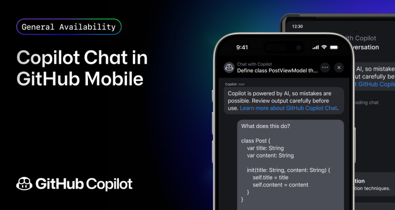
With GitHub Copilot Chat in GitHub Mobile, developers can collaborate, ask coding questions, and gain insights into both public and private repositories anywhere, anytime–all in natural language for users on all GitHub Copilot plans.
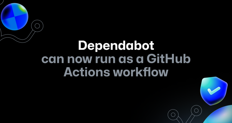
A quick guide on the advantages of Dependabot as a GitHub Actions workflow and the benefits this unlocks, including self-hosted runner support.